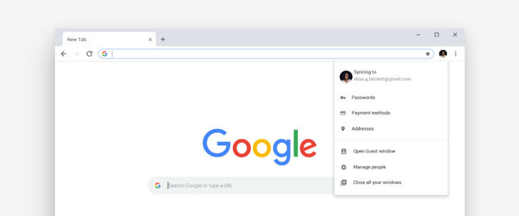
Google’s Material Theme for Chrome rolls out today
Google has been testing major Chrome changes for several months. The updated Material theme has gone through various iterations, and the Android app redesign has been in the works for well over a year.
Customizable New Tab Pages, an improved address bar, and other features have also been in development.
All of this leads up to today’s release of Chrome 69. It includes Google’s new Material Design theme, with rounded tabs and a whiter appearance.
The update for Android enables the Modern Design flag that has been mostly-finished for months. Interestingly, the iOS app now has the address bar on the bottom of the screen, just like the ‘Chrome Home’ UI that was in development for a year on Android but ultimately cancelled.

The address bar now displays answers as you type, so you might find what you’re looking for without even loading a search result. Also, the New Tab Page can now be personalized with custom backgrounds and shortcuts.
Other new features include a password generator, improved autofill, and a ‘Switch to tab’ button if you try to visit a page you already have open.
Chrome 69 will start rolling out today for desktop platforms. It usually takes a few days for the Android version to be released, and we’ll have a full post about it then.
Source: AndroidPolice

